Understanding the Color Wheel and Color Theory
In the realm of art and design, colors are far more than mere decorative elements. They are a language of their own, capable of influencing mood, conveying messages, and creating profound aesthetic experiences. At the heart of this colorful language lies the color wheel, a fundamental tool that helps us understand the relationships between different hues. This article delves into the intricacies of the color wheel and the foundational principles of color theory, offering insights into their application in various creative fields.
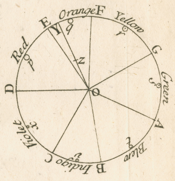
The Genesis of the Color Wheel
The color wheel is a circular diagram that represents the spectrum of colors visible to the human eye. It organizes hues in a coherent and visually logical manner, allowing for easy comprehension of their relationships. The concept dates back to the 17th century when Sir Isaac Newton first arranged the color spectrum in a circle. Since then, the color wheel has evolved, becoming an indispensable tool for artists, designers, and anyone involved in color selection.
Primary Colors
Red, blue, and yellow form the trio of primary colors. These are the foundational colors that cannot be created through the mixing of other hues.
Secondary Colors
When you mix two primary colors in equal measure, you get a secondary color. These include orange (red + yellow), purple (red + blue), and green (blue + yellow).
Color Wheel
Incorporating primary, secondary, and tertiary colors—the latter resulting from mixing a primary color with an adjacent secondary color—enables the creation of a modern and more or less complete color wheel. This refined version, inspired by Johannes Itten's theories, offers a broader and more nuanced spectrum for artistic and design applications.
